If you haven't figured it out yet, I collect Allen & Ginter. In fact, I pretty much solely collect Allen & Ginter. I dabble occasionally in other Topps products like Bowman, but for the most part, the vast majority of my baseball card allowance goes straight to Allen & Ginter. I started collecting the set back in 2007 (I was a junior in high school) while I worked at my LCS. 2007 Ginter was the first hobby box I ever remember buying. I don't really remember how I did, but I do remember loving the set and instantly wanting to collect it.
The set offers a so much in the form of beautiful base cards, wacky insert sets, to rare inserts that can't (and shouldn't) be in any other baseball product. This product is a spin-off of Allen & Ginter cigarettes sold in the late 1800's. They used to include various cards inside each package of tobacco (hence the tobacco sized minis). I was lucky enough to pull and Allen & Ginter original in my case last year.

This specific card is from 1889, the last year of the original Allen & Ginter's existence. It is framed in the normal yellow 2014 Ginter frame and if you look at the card itself, you can actually see that it is in REALLY rough shape. There is a pretty significant rip in the right middle portion of the card. Kinda a bummer, but what can you expect from a card that is over 100 years old and is in Topps possession... not much.
Topps took this brand and created a baseball card set from it in 2006. When the set was first announced, it flew extremely low and under the radar. The main claim to fame for the new brand were two-fold: the introduction of a full base set worth of tobacco sized mini cards that really weren't around to speak of at all, and Topps' hiring of artist Dick Perez to create insert set of hand-painted baseball players. Neither initially got much love or much hype thus Topps' first print run of Allen & Ginter was very small.
The product, however, took off. When people saw the quality that Topps had infused, even into the base cards, distributors couldn't keep it in stock. Topps also took another leaf from the original Allen & Ginter and didn't make the set completely baseball oriented. Instead, the set was based on World Champions of the day (very similar to the most popular vintage Allen & Ginter set that include champion pool players, rowers, baseball, and billiard players). The 2006 set included icons such as Danica Patrick, Robert E. Lee, Abraham Lincoln, Billy the Kid, and other such famous individuals from that year and years past.
Topps continues similar designs and have added little changes from year to year. I plan to go over each set and insert set that Topps has made, but today I decided to just focus on the initial draw to Allen & Ginter: the base card. The simple 350 card base set (50 SP's) is easily the most beautiful base set of cards that Topps has ever done. They are incredibly simple, but they are also almost always closeups that capture emotion and usually eliminate any and all extraneous background.
Below, I have posted a series of base cards from all nine of the current Allen & Ginter sets. I was able to find a player that had a card in every single set (believe me, it was harder than it sounds to do that if you limit yourself to players that you like to look at... Jeter, Pujols, Cabrera). Former Atlanta Brave catcher Brian McCann became the prime suspect.

2006 was the year that drew people in. It's pretty easy to see why. The artwork is phenomenal, as is the shading, and the subtly placed information text. It tells you exactly what you want to know and nothing more (except perhaps team... but he's got a uniform on... who cares). The card just exudes a historical feel to it especially with the off-white or "stained" card stock which, I believe, is exactly what Topps was going for. Heck, even the more modern looking rookie symbol even seems to fit and blend in with the card.
Artwork and Poses: 5 (out of 5)
Text and/or Border: 4.5
Translation to Mini: 4.5
Overall: 4.67

Artwork and Poses: 4
Text and/or Border: 4
Translation to Mini: 4
Overall: 4

2008 was the absolute dream. Artwork went from smudged to precise, detailed, and still featured close-ups. The bottom feature text and white background is what put this set over the top in my opinion. There is absolutely nothing extra on this card. The text is simple and doesn't distract and the focus is clearly on the player. This has always (and probably will always be) my favorite Ginter set.
Artwork and Poses: 5
Text and/or Border: 5
Translation to Mini: 5
Overall: 5

I don't get it. I really don't. This set was simply atrocious as a set builder. This card is a bad example because it features an actual background of a baseball field. Here... I'll get you another:

First of all, what's with his right eye??? In any case, let's start with the good. The text at the bottom is not distracting and simple. Hooray! I'm a fan! Now... complaints. Image selection: HUH? These two cards are just two examples of simply incomprehensibly bad image selection from Topps for this year (and I promise I didn't hand pick Votto). They show little emotion and many aren't even the typical Ginter close-up. In addition, the vast majority of cards seems like Topps had a gaggle of little kids come in and play watercolor paints with all their cardstock. Many of the backgrounds of this set are similar to Votto with the red cloudy shapes behind him, however, unlike this example, the colors are sometimes completely nonsensical and definitely don't look good next to one another in a binder.
One other quick point about this set. The reason I included the category "translation to mini" was primarily because of this set. I hate the full sized base cards, but the minis are much easier to handle visually. There is much less of the unnecessary coloring and the occasional action shots (like McCann's) look better in mini form as well.
Artwork and Poses: 1.5
Text and/or Border: 4.5
Translation to Mini: 5
Overall: 3.67

So continues the run of Ginter's over-complication. I'm not a fan of the aquamarine (or whatever color you want to call it) background. Most of the images are back to the usual close-ups and I like the painting jobs in general. The green is just too much though. Nice try, come again later.
Artwork and Poses: 4.5
Text and/or Border: 2
Translation to Mini: 3.5
Overall: 3.33

My least favorite set. The art is fine and the normal white background is good. The border is just sloppy to me. First, borders tend to exacerbate centering problems, and though I don't think Topps has too much of an issue with it, a border will cause even a slightly off-center card to look bad. Second, this border is simply over the top (especially for Allen & Ginter). Topps decided to completely throw the vintage-esque look out the window for this set and it simply is out of place. Third, this particular border doesn't translate to the tobacco sized card AT ALL. It warps the card image and forces attention to the border and text instead of the subject.
Artwork and Poses: 4.5
Text and/or Border: 2.5
Translation to Mini: 1
Overall: 2.67

2012 and 2013 were almost identical sets. I see virtually no difference between the two. The art is mostly well done close-ups. Most of the non-close-ups (yes, I used two hyphens... deal with it) are horizontal cards. These cards have a very faded background of a crowd which usually look like splotches of paint. Not a huge fan of these. Both of these sets still have the same centering issues due to the presence of a border. Otherwise, I enjoyed how Topps at least tried to go back to a bit more simple design. If I had to give an edge to one set over the other I would give 2012 the slight edge due to a slightly less intrusive border. Pretty close though.
Artwork and Poses: 4
Text and/or Border: 3.5
Translation to Mini: 4
Overall: 3.83

See above. Oh wait... here's some crowd blobs. :D

Artwork and Poses: 4
Text and/or Border: 3.5
Translation to Mini: 4
Overall: 3.83
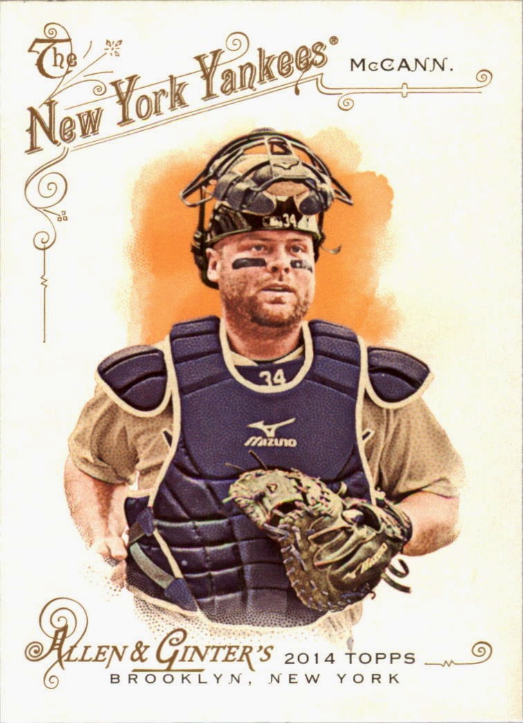
Last, but not least is the 2014 set. I thoroughly enjoyed this set. This has definitely felt the most throw-back-ish (did it again...) type set since 2008. I like the removal of a strict border and though there is a lot of text and it seems busy, the focus is 100% on the card subject and image. Whoever designed the card layout did a very nice job. The images are very similar to those of 2012 and 2013, even including the horizontal action shots with blobs of crowd in the background, though I did see a little more distinction in most of the crowd backgrounds which made them a little better.
Artwork and Poses: 4
Text and/or Border: 4.5
Translation to Mini: 4
Overall: 4.17
That would put the overall order of base set preferences in the following order:
08
06
14
07
12
13
09
10
11
Let me know if you disagree or give me your own rankings!
No comments:
Post a Comment